Really like this
Web Trend Map from
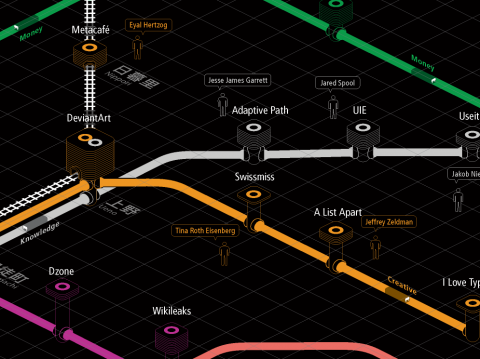
iA inc. This annual map charts the most frequented and influential sites visited on the web, but the cool thing is that its all charted on the layout of the Tokyo metro map. Each colored subway line represents a different category, for instance knowledge, creativity, or news. Along a given line various sites are mapped depending on popularity and traffic, and their proximity to the center of the map correlates to the highest traffic. A very cool way of viewing the web, and a great way to discover some sites that you never knew about. Thanks iA!
Via swissmiss


No comments:
Post a Comment